
phatjazz
phatjazz is a Denver, Colorado based DJ and producer. He plays venues around the US, releases original tracks, and developed a widely followed mixtape series.
View Websitephatjazz
phatjazz is a Denver, Colorado based DJ and producer. He plays venues around the US, releases original tracks, and developed a widely followed mixtape series.
View Website
My Role
UX/UI Designer
Timeline
Nov 2022
Team
Project Manager
Developer
Developer
Tools
Figma
Webflow
Adobe Photoshop
Adobe Illustrator
Webflow
Adobe Photoshop
Adobe Illustrator
Overview
Building the brand.
In 2017, phatjazz started a series of mixes for friends coined "The Spice Cabinet". The project eventually blossomed and he found himself playing venues around Denver. In 2022, he began to release his first original tracks and played his first shows outside of Colorado. He looks to continue his upward momentum in 2023 when he plays the The Governors Ball Music Festival in New York City behind headliners Kendrick Lamar, Lizzo, and Odesza.
In 2017, phatjazz started a series of mixes for friends coined "The Spice Cabinet". The project eventually blossomed and he found himself playing venues around Denver.
In 2022, he began to release his first original tracks and played his first shows outside of Colorado. He looks to continue his upward momentum in 2023 when he plays the The Governors Ball Music Festival in New York City behind headliners Kendrick Lamar, Lizzo, and Odesza.
In 2022, he began to release his first original tracks and played his first shows outside of Colorado. He looks to continue his upward momentum in 2023 when he plays the The Governors Ball Music Festival in New York City behind headliners Kendrick Lamar, Lizzo, and Odesza.

Problem
Outgrowing Instagram.
phatjazz does not have a cohesive location to promote his brand, showcase his music, and entice potential promoters. Although he has gained considerable traction using Instagram for building his reputation and expanding his fanbase, he wants to elevate his brand further by having a multi-purpose responsive website. Instagram does not will him to have complete control over the content displayed and how it is presented, it does not allow for more comprehensive and detailed information, and it does not allow for a permanent and stable digital presence. All of which are vital for building a professional brand.
phatjazz does not have a cohesive location to promote his brand, showcase his music, and entice potential promoters. Although he has gained considerable traction using Instagram for building his reputation and expanding his fanbase, he wants to elevate his brand further by having a multi-purpose responsive website.
Instagram does not will him to have complete control over the content displayed and how it is presented, it does not allow for more comprehensive and detailed information, and it does not allow for a permanent and stable digital presence. All of which are vital for building a professional brand.
Instagram does not will him to have complete control over the content displayed and how it is presented, it does not allow for more comprehensive and detailed information, and it does not allow for a permanent and stable digital presence. All of which are vital for building a professional brand.
Solution
A permanent digital presence.
We developed a responsive website that would enable phatjazz to effectively market himself and his brand to both fans and promoters. Our goal was to create a digital platform that would embody the playful and imaginative nature of his music while providing a memorable and user-friendly experience.
Landing Page
Immerse yourself in the world of phatjazz.
Ability to select your desired page and access social media accounts.
Memorable landing page that reflects the phatjazz brand.
Memorable landing page that reflects the phatjazz brand.
Bio Page
The origin story.
Get to know phatjazz through text and images. Allows promoters and fans to hear his story.
Navigate to various pages and links.
Navigate to various pages and links.
Music Page
Where the music comes alive.
View phatjazz's discography. See his latest singles, remixes, and mixes.
Links take you to Spotify, Soundcloud, and YouTube.
Links take you to Spotify, Soundcloud, and YouTube.
Events Page
Explore upcoming and past shows.
A digital resume for promoters to see where phatjazz has played.
Fans can see upcoming shows and purchase tickets.
Fans can see upcoming shows and purchase tickets.
Contact Page
Get in touch with phatjazz.
Say hello or book a show. Promoters and fans can reach out to phatjazz.
Contact page is a compliment to the contact menu button.
Contact page is a compliment to the contact menu button.
Research
Exploring the scene.
We wanted to evaluate how musicians display themselves online and what users looks for in those environments. To do this we ran a competitive analysis and conducted users interviews with the following goals.
• Understand what the client needs/wants are.
• Understand what the client is trying to solve by having a website.
• Understand the process of how people currently find/look-up musicians.
• Understand what people look for in a musician’s website.
• Understand what the client is trying to solve by having a website.
• Understand the process of how people currently find/look-up musicians.
• Understand what people look for in a musician’s website.
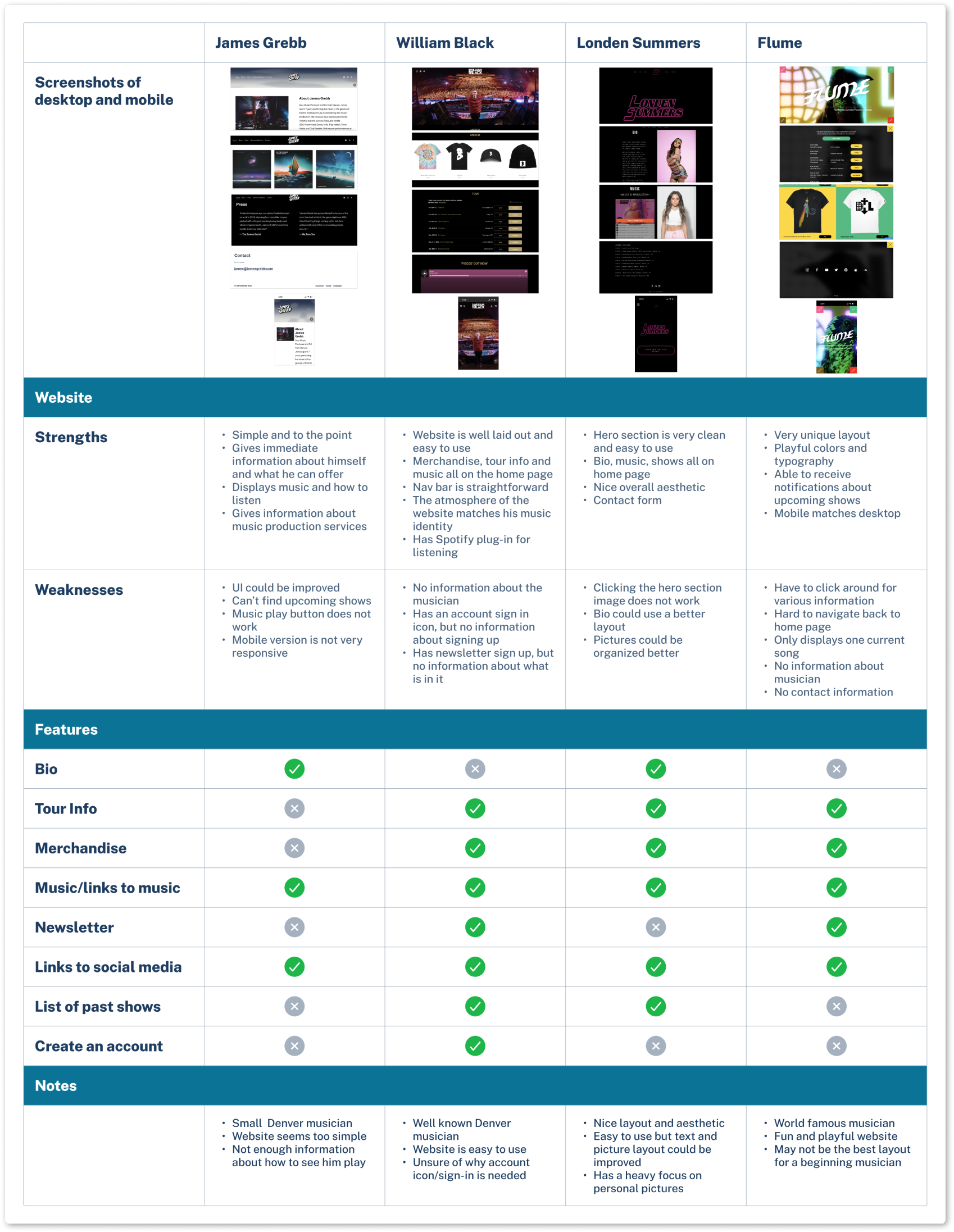
Research - Competitive Analysis
Websites varied by popularity and genre.

Upon conducting an analysis of a diverse range of musicians, spanning from those of similar popularity to phatjazz, to globally renowned stars, certain trends emerged.
• Musicians with lower popularity had easy to navigate websites, but lacked originality and functionality.
• Musicians with higher popularity had memorable, interesting websites but lacked usability and basic information.
• Musicians with higher popularity had memorable, interesting websites but lacked usability and basic information.
These findings provided insight into the factors that drive success in the music industry and highlighted the strategies that have proven to be most effective in building a fanbase and establishing a brand identity. This information served as a valuable resource for our work with phatjazz, enabling us to tailor our research to his specific needs and goals while keeping in mind the broader industry trends and best practices.
Research - User Interviews
Gathering perspectives.
In order to gain deeper insights into the preferences of the stakeholder and insights from the target audience, we conducted a series of user interviews. The aim was to gain an understanding of the client's needs and goals for their website, as well as to research how people currently discover and engage with musicians online. This information informed the design of the website to meet the client's objectives and the user's expectations. Full interview report here


Research - Interview Outcomes
Key insights.
Upon sifting through the interview data and clustering it into an affinity map, several recurring themes began to emerge. The most prominent of these were focused on the key needs of the stakeholder who expressed a desire for a centralized location that could provide all necessary information pertaining to their brand. The target audience's insights revolved around authenticity and information.
Stakeholder
• Website to be a one-stop shop for all things related to phatjazz
• Look attractive for fans and look legitimate for potential promoters. Interesting and unique.
• Tried to make a website previously but gave up due to time and design constraints
• Use website as driver for future bookings
• Include bio, past shows, links to social media and streaming platforms, pictures, contact page
• Mainly uses Instagram to promote himself along with Linktree
Users
• Finds concerts by Googling the artist and then usually going to their website
• Finds new music/musician’s via streaming services
• Websites make musicians look more legitimate
• Likes to typically read a musician’s biography
• Enjoys websites that are fun, interesting, and easy to navigate
• Would buy merchandise if available
Stakeholder
• Website to be a one-stop shop for all things related to phatjazz.
• Look attractive for fans and look legitimate for potential promoters. Interesting and unique.
• Tried to make a website previously but gave up due to time and design constraints.
• Use website as driver for future bookings.
• Include bio, past shows, links to social media and streaming platforms, pictures, contact page.
• Mainly uses Instagram to promote himself along with Linktree.
Users
• Finds concerts by Googling the artist and then usually going to their website.
• Finds new music/musician’s via streaming services.
• Websites make musicians look more legitimate.
• Likes to typically read a musician’s biography.
• Enjoys websites that are fun, interesting, and easy to navigate.
• Would buy merchandise if available.
Research - User Persona
Meet Addie!
We developed a user persona that distilled the research findings and synthesized the key insights gleaned from our user interviews. This allowed us to create a clear and concise picture of the target audience, ensuring that our design and development efforts were geared towards meeting their needs.

Research - Synthesis
Finding the Problem
We filtered the research findings into clear and actionable statements, which served as the foundational pillars of our design process and provided a framework for ideation. Our aim was to create statements that were flexible enough to allow for a variety of solutions, yet specific enough to ensure a consistent and cohesive direction for the project.
Stakeholder
• How might we structure the website to be user friendly and informational?
• How might we help me synchronize the website’s design to match musician’s brand?
• How might we grow a new musician’s fan base via their website?
• How might we attract promoters and drive bookings for a new musician?
User
• How might we align musician and user goals/needs for a website?
• How might we create a user centric website design?
• How might we efficiently notify music fans about artist updates?
• How might we help users more effectively support new musicians?
Building the Solution - Feature Prioritisation
Concentrating on what matters.
Given the limitations imposed by time and technical considerations, we focused on the features that would yield the greatest benefits for the users. To this end, we employed a priority matrix that enabled us to rank the importance of each feature. Throughout this process, our user personas and action statements proved to be essential tools in guiding our decision-making and ensuring that we remained true to our design goals.
To deliver a satisfactory website within the designated two-week timeframe, we opted to prioritize low-effort, high-impact features. Technical limitations also influenced this decision as we were responsible for not only designing but also building the responsive website in Webflow.
To deliver a satisfactory website within the designated two-week timeframe, we opted to prioritize low-effort, high-impact features. Technical limitations also influenced this decision as we were responsible for not only designing but also building the responsive website in Webflow.

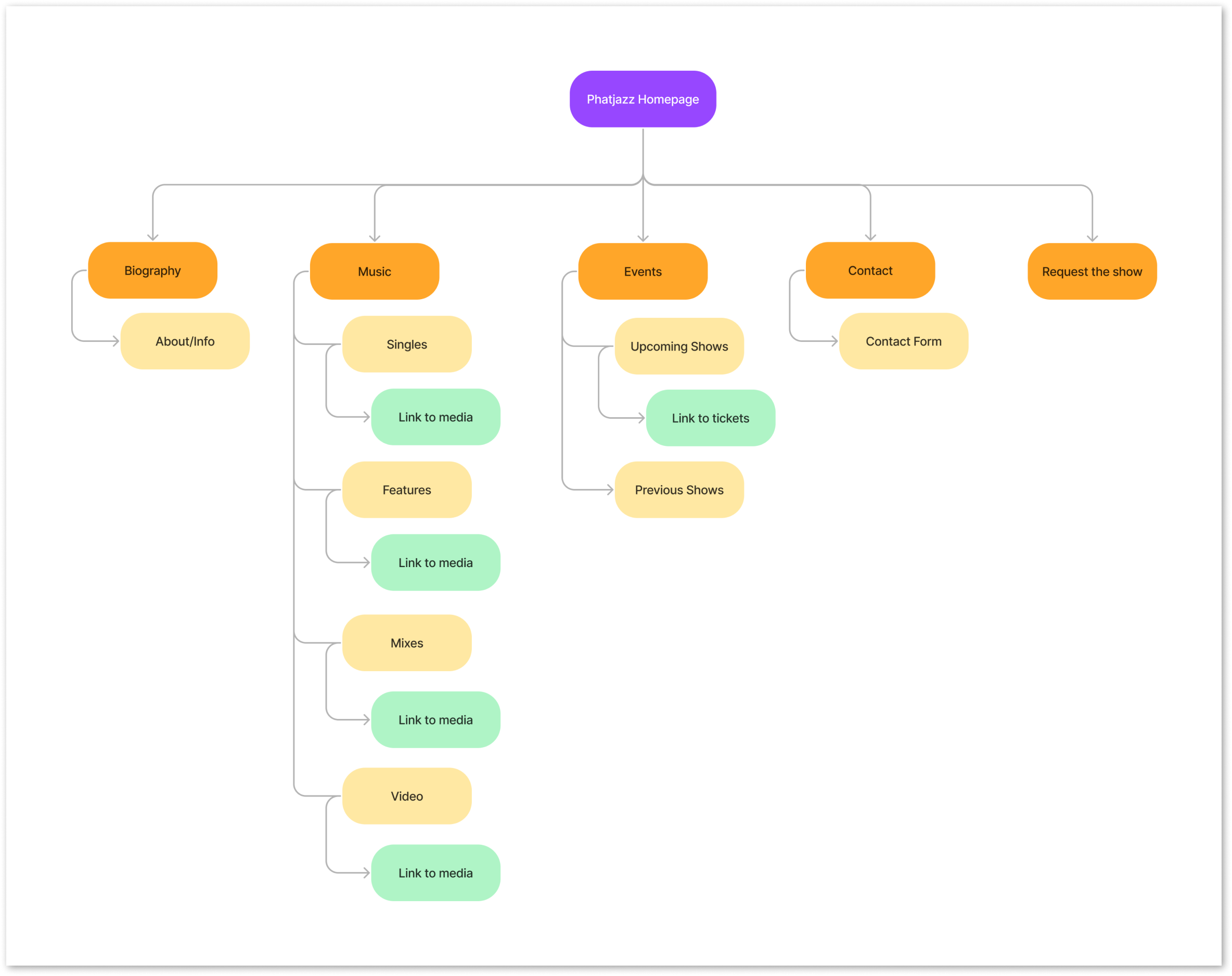
Building the Solution - Sitemap & Flows
Keeping the stakeholder at the forefront.
By means of the sitemap, we attained a clear and simple overview of the website's structure. The objective was to enhance the user experience through streamlined navigation. The sitemap highlighted the essential features that held significance for the stakeholder which were biography, music, events, and contact.
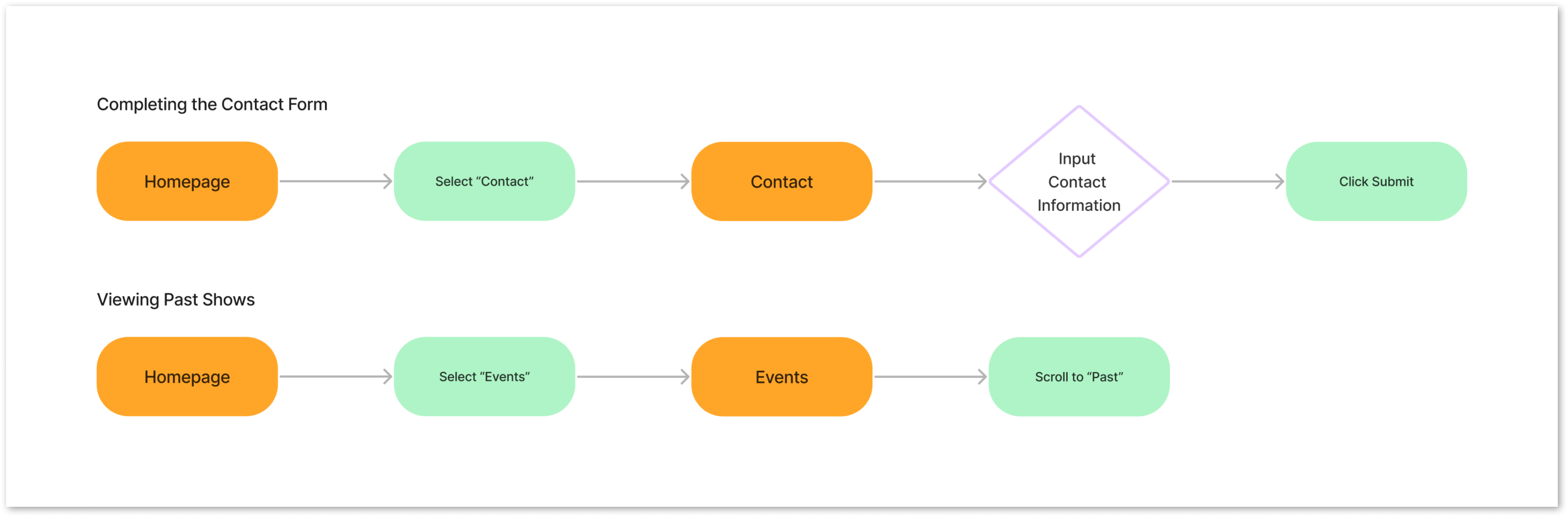
Task Flows.
To further confirm or challenge the assumptions we gathered during the research phase, we devised the following task flows. These task flows serve to demonstrate two of the most important sections for the website, which are contacting phatjazz for bookings and viewing upcoming/past shows. These flows were determined based consultation with the stakeholder regarding his prioritization of needs.
Building the Solution - Wireframes
Initial wireframes.
After consulting with the stakeholder, we determined that the priority should be on creating a minimum viable product with the following essential screens. The goal was to create a design where the most critical information was easily accessible through scrolling. The stakeholder's priority was to minimize the number of clicks required. Find full desktop wireframe here


Building the Solution - Wireframes
Bringing the wireframes to life.
We utilized digital assets provided by the stakeholder, incorporating them into the design to maintain consistency with the brand. We focused on creating a responsive website that would function equally well on both desktop and mobile devices, ensuring that users would have a consistent experience across all platforms. We aimed to capture the essence of the stakeholder's brand and convey it in an aesthetically pleasing way. Emphasis was placed on the stakeholder's priority to encourage scrollability and minimize the number of clicks.


Building the Solution - Feedback
Design feedback.
We presented the initial design to the stakeholder with the aim if ensuring alignment with their vision and ideals. We reviewed each function and screen of the desktop and mobile designs. The feedback from the stakeholder allowed us to identify alternatives and improvement. Full feedback report here
Key Outcomes
• Work towards a more memorable design that looks less like a pre-made template.
• Create pages for each section instead of continuous scrolling.
• Have the website appeal more to promoters and booking agents rather than casual fans.
• Work towards a more memorable design that looks less like a pre-made template.
• Create pages for each section instead of continuous scrolling.
• Have the website appeal more to promoters and booking agents rather than casual fans.
Building the Solution - First Iteration
Design iteration.
Following discussions and feedback from the stakeholder, the design was reimagined. As a result, both the desktop and mobile designs were revised to embody a more unique and authentic style. Careful attention was paid to incorporating the stakeholder's feedback, while also creating a new design that was not only functional but also visually appealing.
To optimize user navigation, the decision was made to use multiple pages instead of one extended scrolling page. To further assist users in finding relevant content, a menu bar was implemented on the left-hand side of the website. This menu bar was designed to be visually prominent and intuitive, offering users an easy-to-use and straightforward means of navigating through the website. In order to drive specific user actions, two buttons were added to the menu: "Request a Show" and "Donate Here." These buttons served as clear calls-to-action, encouraging users to engage. To streamline the presentation of visual content, all images were consolidated into their respective pages. Arrow icons were included where applicable to ensure that users knew to click for additional content.
Before

After


In accordance with the desktop redesign, the mobile version was also revamped with the utilization of multiple pages and the incorporation of a menu. Additional image assets were introduced to their respective pages, resulting in an overall improvement of the site's visual appeal. This redesign effort aimed to provide a more distinctive and unique experience, departing from the traditional, pre-existing template feel of the prior design.
Before

After

After

After

After

After

Building the Solution - Branding
Visual identity.
phatjazz desired a design that would represent his energetic personality while also reflecting a modern electronic musician's style. The challenge was to create a memorable and distinctive design without being too ostentatious.
The logo was crafted by combining the letters "p" and "j" into a music record design. To avoid the sharp edges typically associated with electronic musicians, the logo was stylized in lowercase letters. The logo can be used in various configurations such as stacked, horizontal, or separated. The typography and icons were carefully chosen to remain within the modern DJ palette. A neutral color scheme was chosen to allow the album covers and show images to shine.
The logo was crafted by combining the letters "p" and "j" into a music record design. To avoid the sharp edges typically associated with electronic musicians, the logo was stylized in lowercase letters. The logo can be used in various configurations such as stacked, horizontal, or separated. The typography and icons were carefully chosen to remain within the modern DJ palette. A neutral color scheme was chosen to allow the album covers and show images to shine.
phatjazz desired a design that would represent his energetic personality while also reflecting a modern electronic musician's style. The challenge was to create a memorable and distinctive design without being too ostentatious.
The logo was crafted by combining the letters "p" and "j" into a music record design. To avoid the sharp edges typically associated with electronic musicians, the logo was stylized in lowercase letters. The logo can be used in various configurations such as stacked, horizontal, or separated. The typography and icons were carefully chosen to remain within the modern DJ palette. A neutral color scheme was chosen to allow the album covers and show images to shine. Full library here
The logo was crafted by combining the letters "p" and "j" into a music record design. To avoid the sharp edges typically associated with electronic musicians, the logo was stylized in lowercase letters. The logo can be used in various configurations such as stacked, horizontal, or separated. The typography and icons were carefully chosen to remain within the modern DJ palette. A neutral color scheme was chosen to allow the album covers and show images to shine. Full library here

Building the Solution - Usability Testing
Testing the prototype.
Through conducting five moderated usability tests, we gained valuable insights that informed iterative revisions to the hierarchy and layout of the design. Participants were presented with three different scenarios to navigate using the Figma prototype. The scenarios focused on finding where phatjazz has previously played, locating recently released music, and booking a show. Using the results of the testing, we were able to fine-tune the prototype and further optimize its usability.
Before

After

01
Improving the mobile interface
Users wanted more defined mobile screen hierarchy and an easier to use menu icon.
We opted to eliminate the textual label from the menu, substituting it with a universally recognized hamburger icon. To improve the legibility and visual hierarchy, we implemented adjustments to the text spacing between the header and body sections, as well as the addition of a line separator. This served to create a more organized and visually clear layout for the content.
We opted to eliminate the textual label from the menu, substituting it with a universally recognized hamburger icon. To improve the legibility and visual hierarchy, we implemented adjustments to the text spacing between the header and body sections, as well as the addition of a line separator. This served to create a more organized and visually clear layout for the content.
Before
After
02
Enhancing the mobile menu
Users wanted the mobile menu screen to be more intuitive.
In the menu interface, we incorporated a prominent close icon while doing away with the touch closure functionality altogether. Additionally, buttons were optimized for the mobile screen.
In the menu interface, we incorporated a prominent close icon while doing away with the touch closure functionality altogether. Additionally, buttons were optimized for the mobile screen.
Before

After

02
Enhancing the mobile menu
Users wanted the mobile menu screen to be more intuitive.
In the menu interface, we incorporated a prominent close icon while doing away with the touch closure functionality altogether. Additionally, buttons were optimized for the mobile screen.
In the menu interface, we incorporated a prominent close icon while doing away with the touch closure functionality altogether. Additionally, buttons were optimized for the mobile screen.
Before
After
Before

After

03
Adjusting icon size
Users had difficulty clicking the arrow icons when viewing images.
To address this issue, the arrow icons were increased in size. The increased size also helps to draw the user's attention to these interactive elements, ensuring that they are easily identifiable and usable.
To address this issue, the arrow icons were increased in size. The increased size also helps to draw the user's attention to these interactive elements, ensuring that they are easily identifiable and usable.
Before
After
Conclusion
Final thoughts.
This project provided me a unique opportunity to collaborate with a stakeholder and deliver a product that was implemented in the real world. The most rewarding aspect of this project was getting to work with the stakeholder and navigating the intricacies the relationship. This enabled me to enhance my communication skills when working with external parties and to hone my ability to craft a succinct message.
The most significant challenge I faced during this project was the need to undertake major design iterations following stakeholder consultations. This challenge forced a re-evaluation of my design approach, leading to me to iterate on the design while emphasizing stakeholder feedback and ensuring the preservation of a unified concept. Given more time and resources, I would have liked to explore user research more intensely and iterate additional alternative solutions.
The most significant challenge I faced during this project was the need to undertake major design iterations following stakeholder consultations. This challenge forced a re-evaluation of my design approach, leading to me to iterate on the design while emphasizing stakeholder feedback and ensuring the preservation of a unified concept. Given more time and resources, I would have liked to explore user research more intensely and iterate additional alternative solutions.
© 2023 Object.Yard